
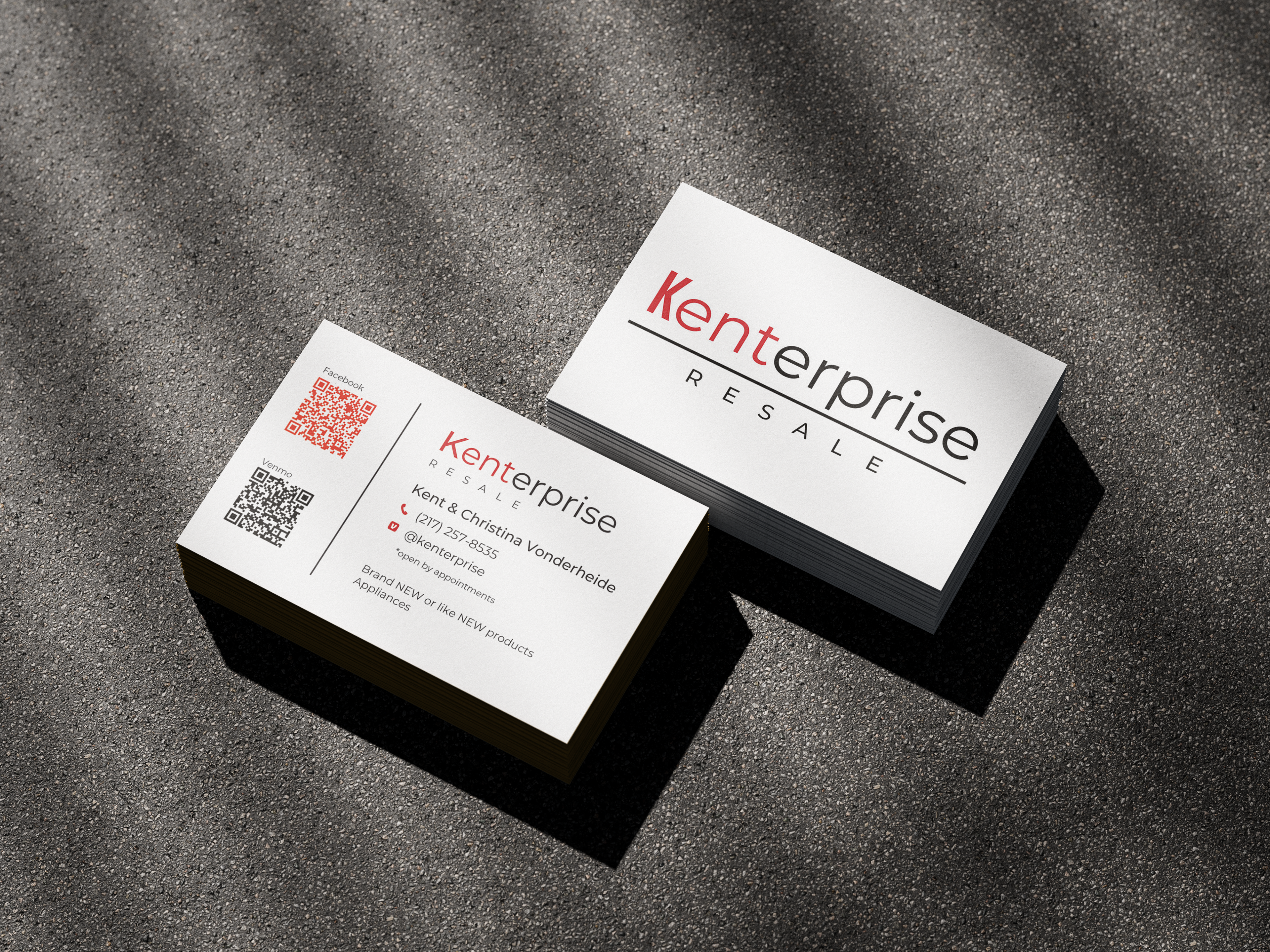
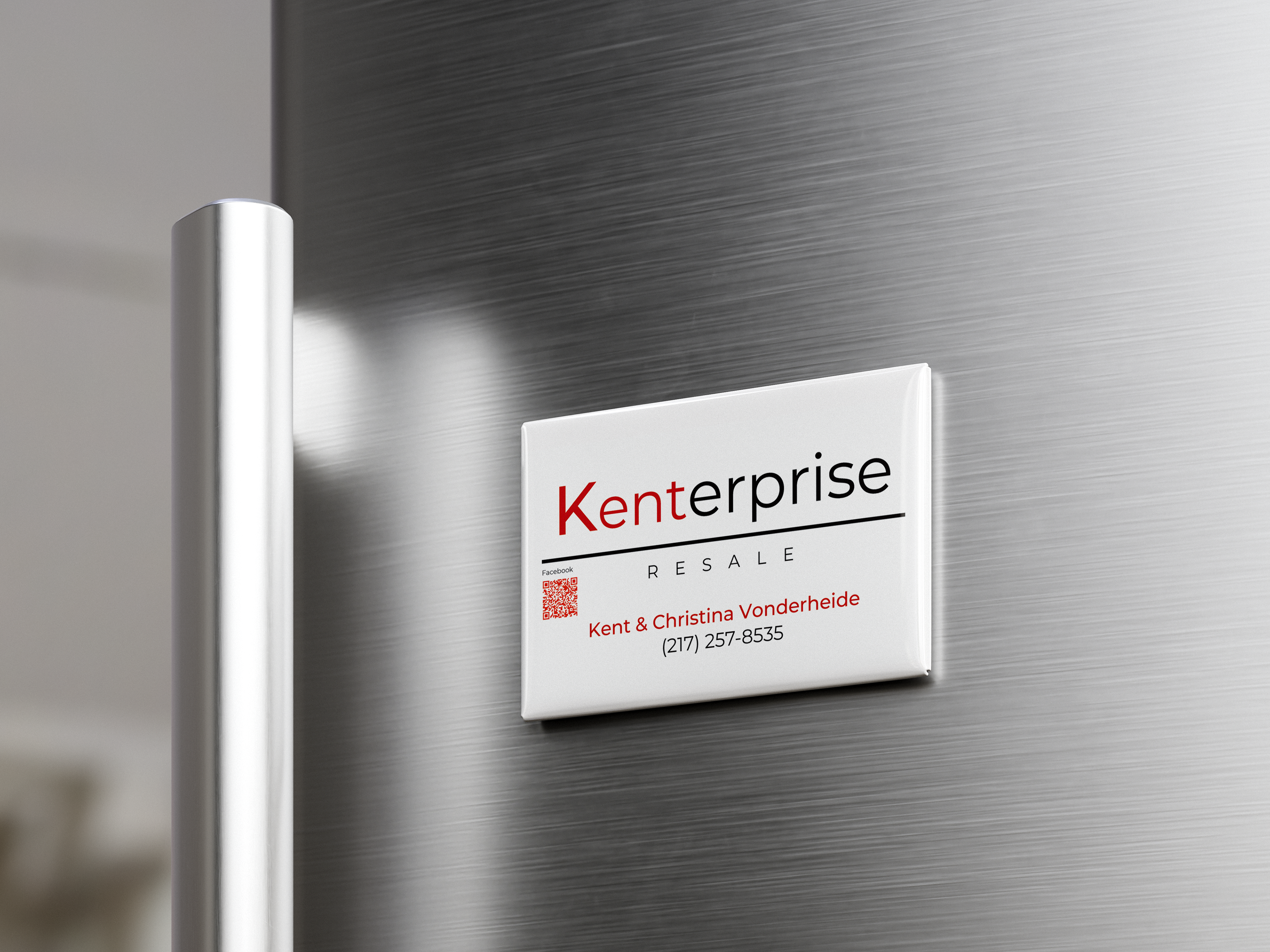
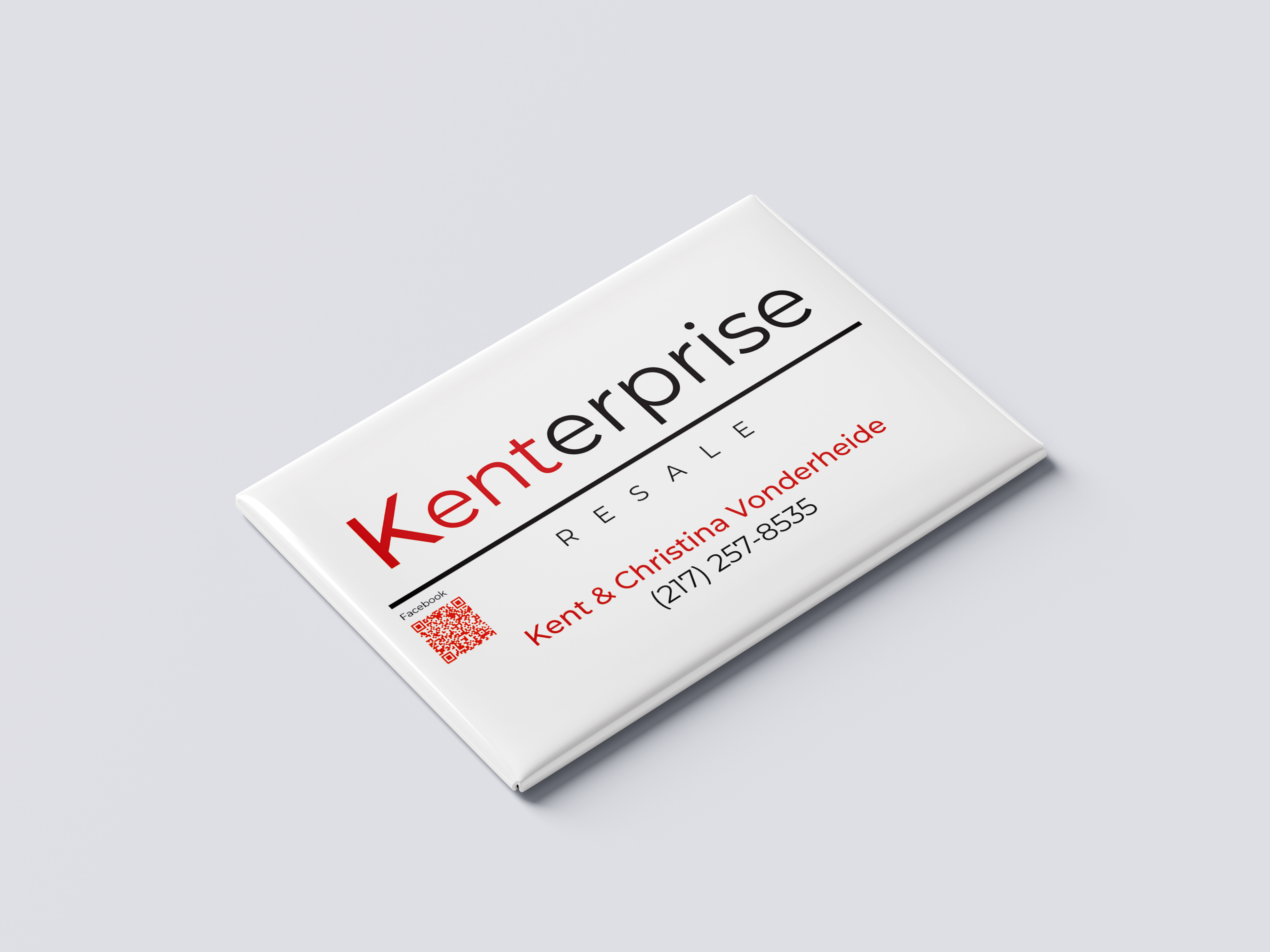

Kenterprise Resale is a small business that purchases and resells lightly used or new pallets of merchandise with minor cosmetic imperfections. The logo design centers around a clever play on words, combining the owner’s first name, Kent, with Enterprise. Special emphasis was placed on “Kent” to ensure the name stands out and becomes the focal point of the brand identity. The overall concept reflects entrepreneurship, simplicity, and trust. A clean typographic font, Montserrat, was chosen to communicate professionalism and clarity. The minimal design ensures the logo performs well across digital and print applications, creating a strong, recognizable visual presence for the brand.