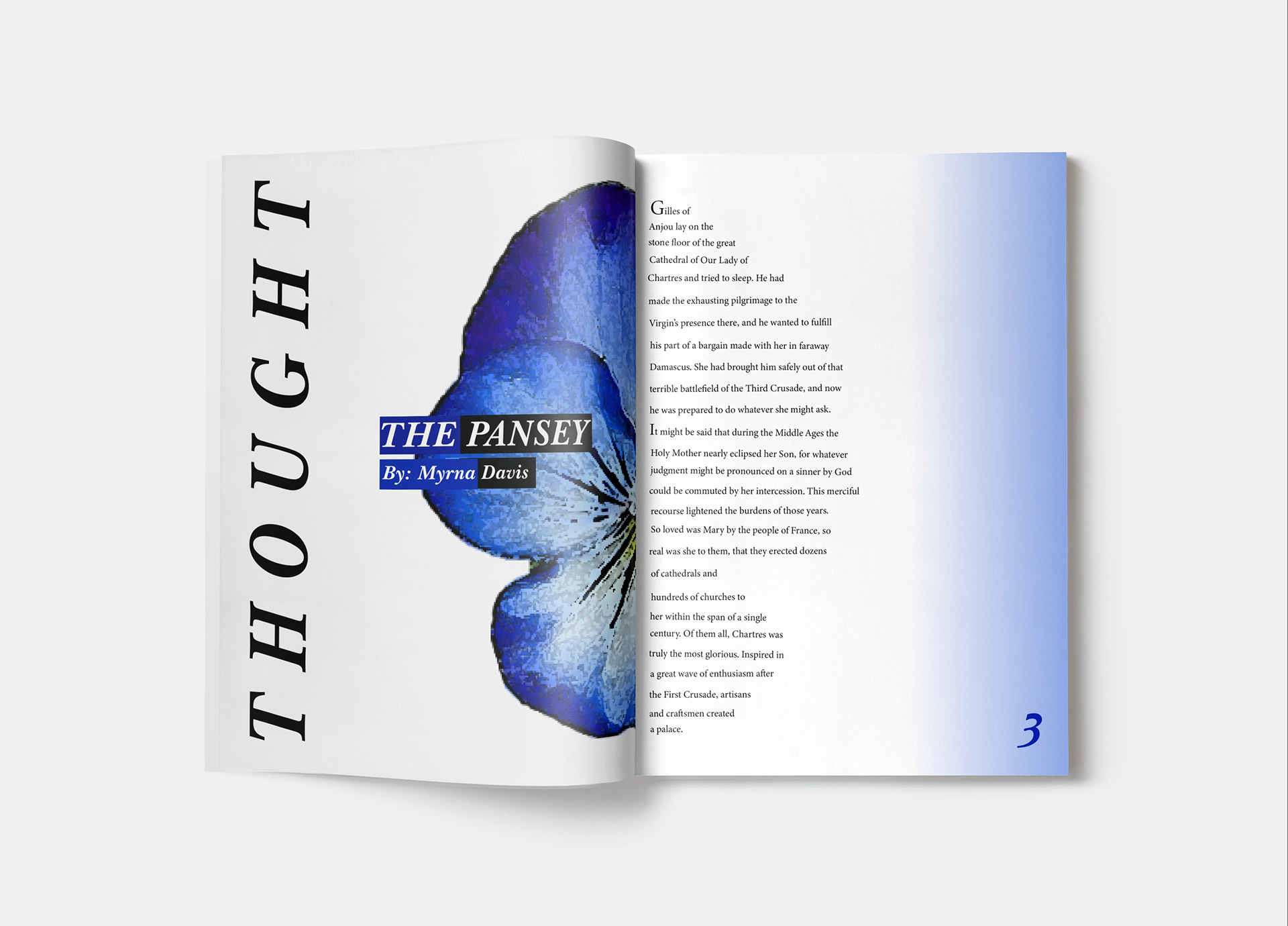
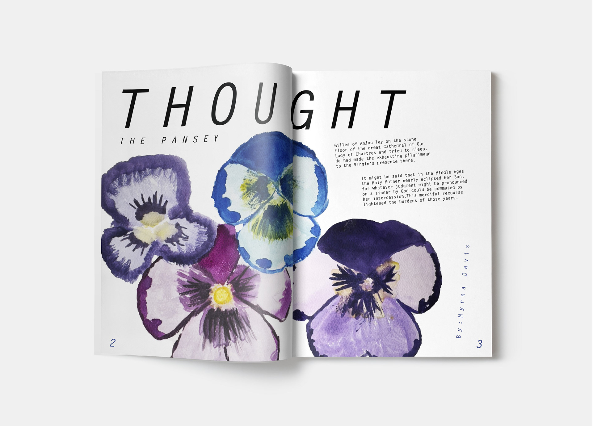
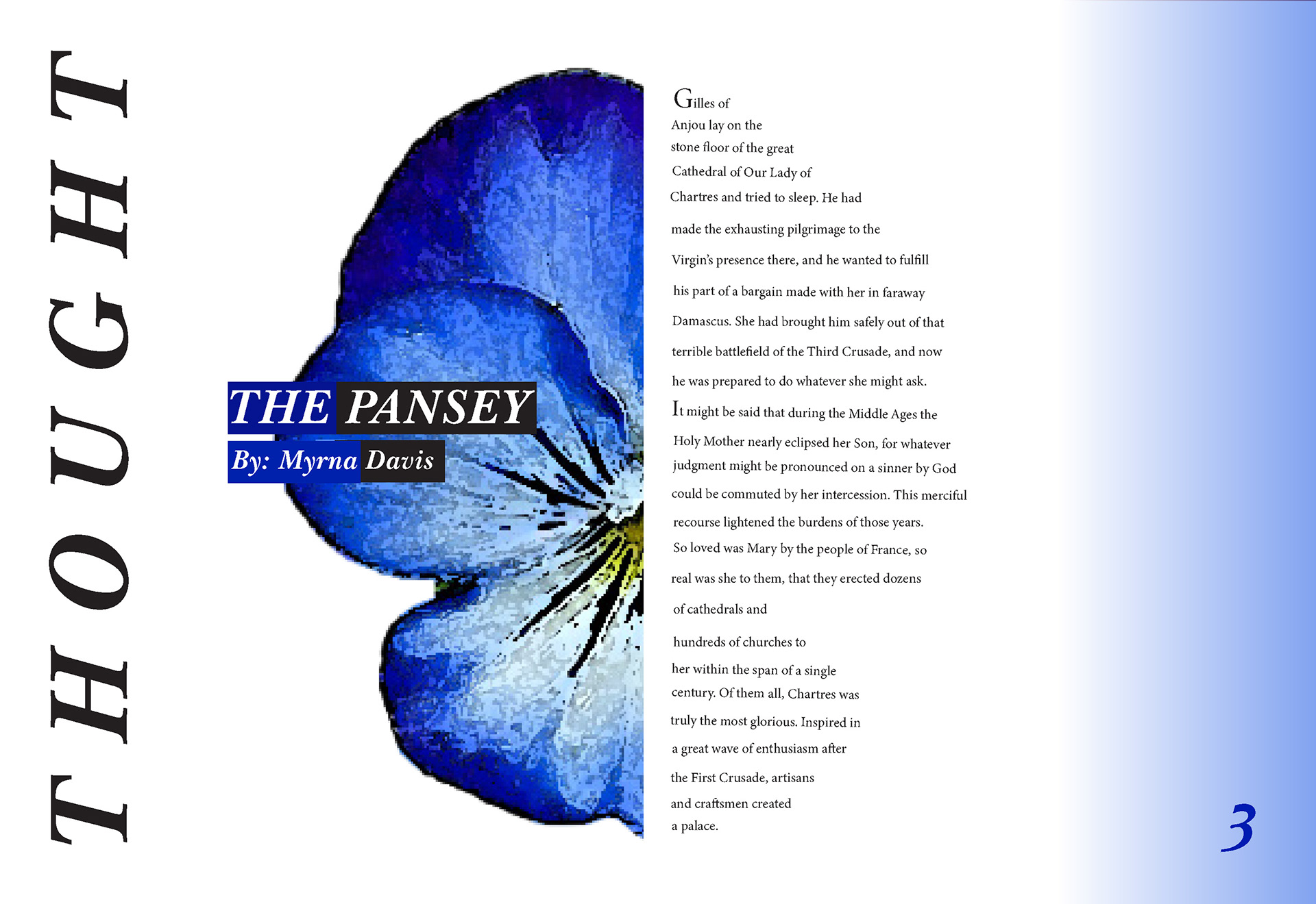
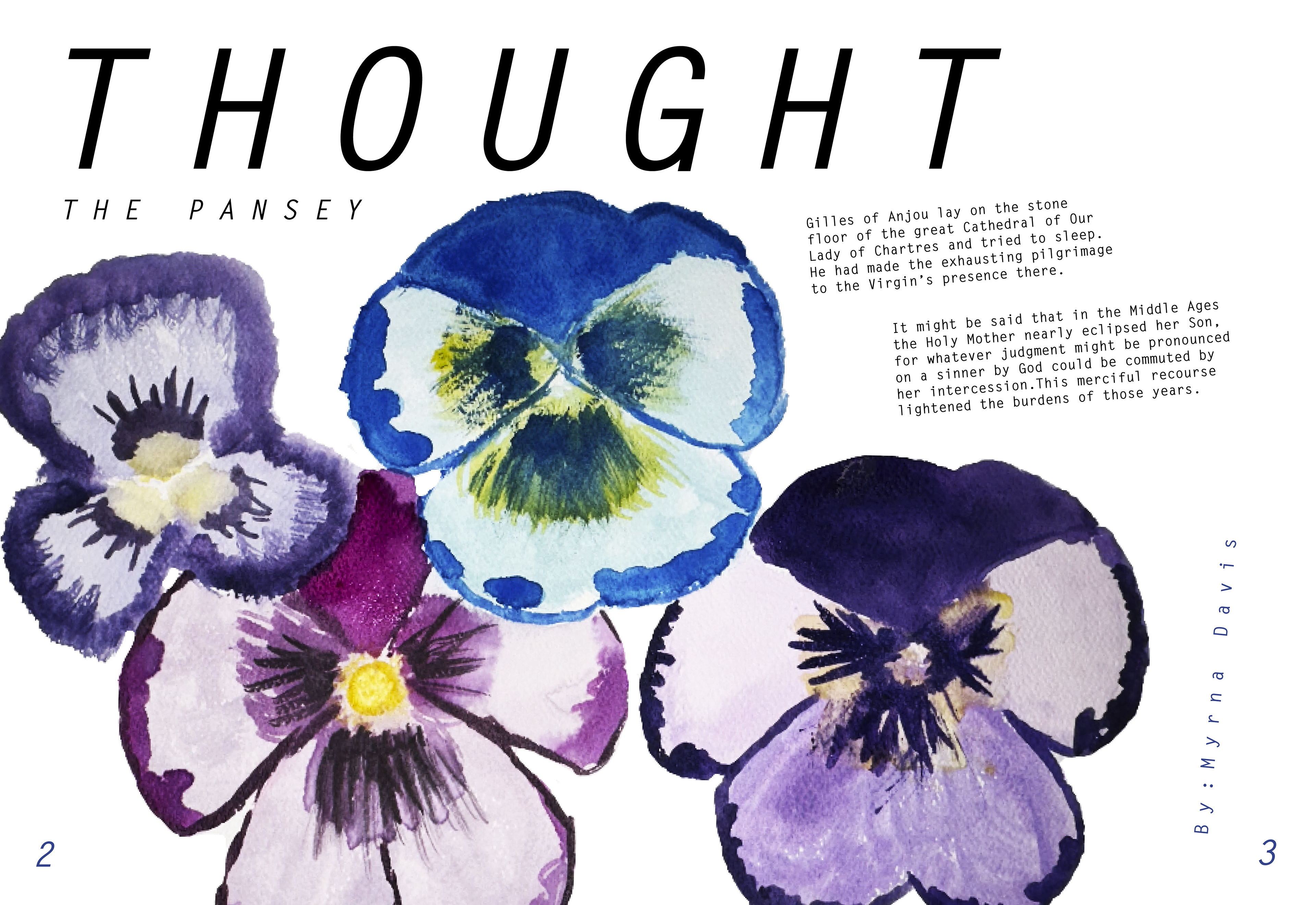

For one of my Image Design class assignments, I designed two magazine spread layouts using the same article in two different styles: a sophisticated version and a playful, kid-friendly version, where I painted the flowers. I focused on how typography, spacing, color, and imagery can set the mood, while maintaining clear hierarchy and readability throughout.